How to Create a Clean 3D Notepad in Photoshop
http://cs5tutorial.net/how-to-create-a-clean-3d-notepad-in-photoshop/
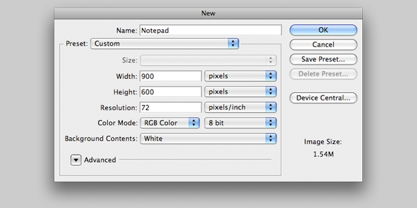
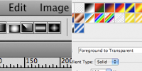 First off, we’re going to get our canvas and background set up. Create a new document nine hundred wide by six hundred high, and call it Notepad. Then, set the background colour to #D4D4D4. To give the background a nice touch, set the foreground colour to #EDEDED, select the Gradient tool then drag out a large radial gradient from the center of your canvas, you may want to zoom out to do this.
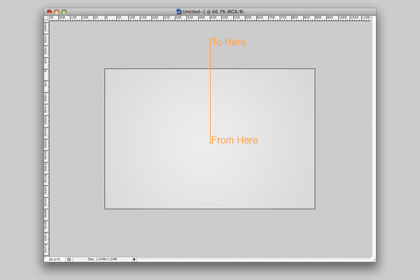 Now we have our gradient set up, we’ll get going on the shape of our notepad. This next bit is the most important, as we’ll use this shape throughout the tutorial.
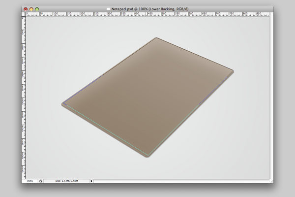
 Create a new layer called ‘Lower Base‘, then press P on your keyboard to select the pen tool, or click the icon in your tools palette. You need to create a shape like the one below. Have a go at creating your own, but you can always draw round this shape if you struggle. Make sure your pen tool is configured the same as in the image to the left, or you’ll get a different result to me.
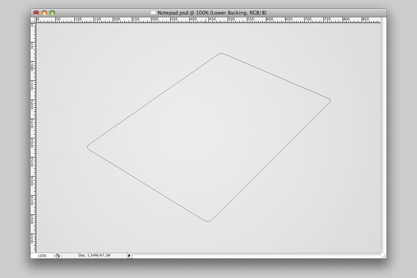
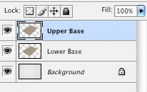 Next, we need to fill the shape with our cardboard colour. Press A on your keyboard to launch the direct selection tool. Now left click inside your shape, and choose ‘Make Selection‘. Set your foreground colour to #A69889, then select your paint bucket tool by pressing G and fill your selection. Finally, duplicate the Lower Base layer, and press the Up Arrow on your keyboard five times. Rename the duplicate Upper Base.
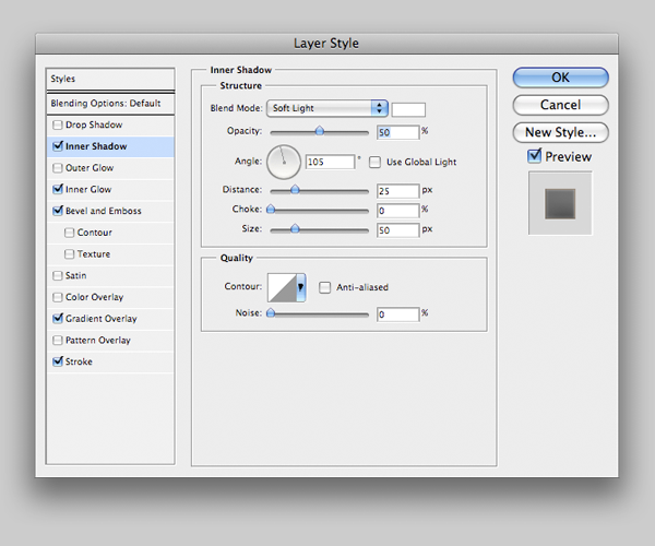
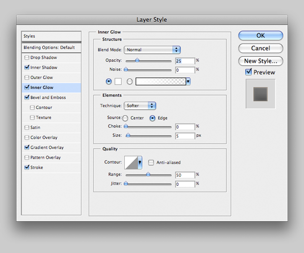
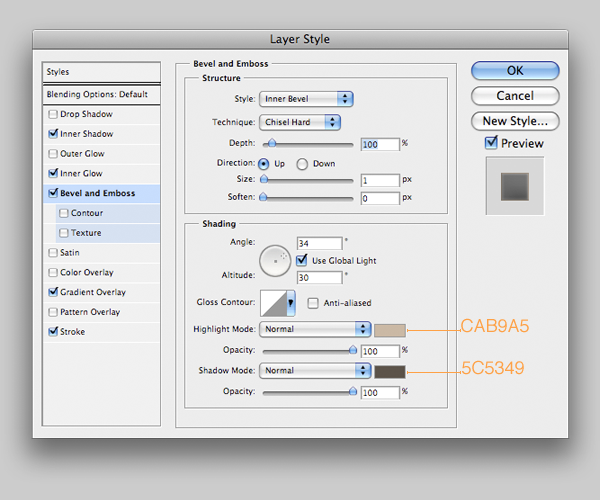
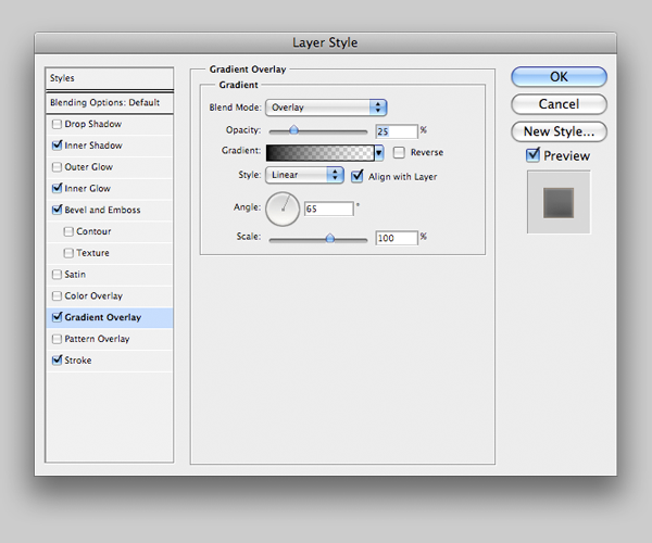
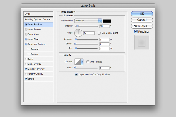
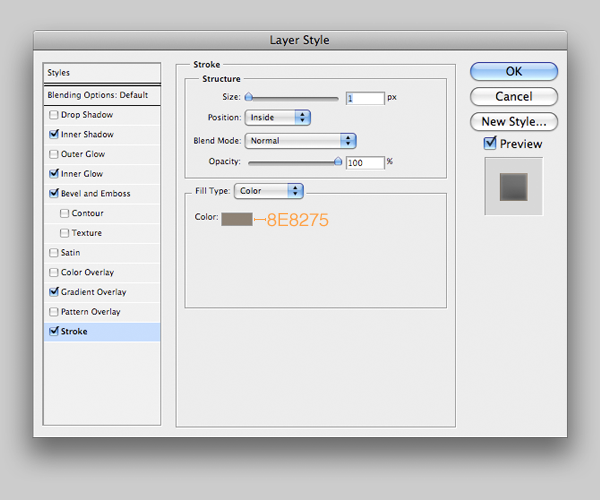 Now apply the styles below to the Lower Base layer.
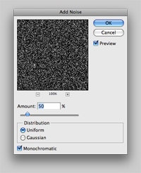 Starting to take shape! Next, we’re going to add a touch of texture to the base before we move on. First create a new layer called Texture 1, and fill it with black. Go to Filter > Noise > Add Noise and set the amount to 50%, then press Enter. The layer should be just above your Upper Base layer, so left click it in the layers panel and select Create Clipping Mask. Set the blend mode to Multiply and the opacity to 5%.
Make a new layer, Texure 2, then repeat the process of filling and adding noise to it. This time though, before we make it a clipping mask we’re going to go to Filter > Filter Gallery, and under Artistic select Dry Brush. Your settings should be as follows, Brush Size: 2, Brush Detail: 5, Texture: 1. If you’ve done that correctly, you’ll now have just a few rough looking patches of white, on a black background. Now set the blend mode to Screen and the opacity to 10%, and make the layer a clipping mask.
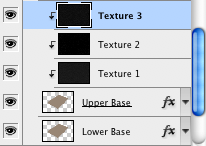 Make one more new layer called Texture 3, and repeat the steps up to add noise. We’re using one of the filters again, so launch the Filter Gallery. Under Brush Strokes, select Crosshatch this time. Use the following settings. Stroke Length: 10, Sharpness: 5, Strength: 1. Once you’ve done that, press OK and use the same blend mode and opacity as last time. Make the layer a Clipping Mask, and then we’re done on step one!
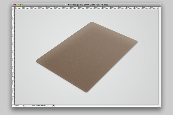
This is what your image should look like at the end of this stage. If it doesn’t, I’d suggest trying to adjust what you’ve done, as it really isn’t that complicated.
 In this step, we’re going to work on the paper. To start off, we need to create the shape. Create a new layer, and call it Paper. Once you’ve done that, make sure your layer is selected then press Cntrl + G on a PC, or Command + G on a Mac. What we’ve just done is placed our layer in it’s own group. Why? Because in a bit, we’ll have around fifteen copies of the same layer, and it’ll be a mess if we don’t organise them somehow. Rename your group Sheets.
Okay, let’s start. First off we need to draw the shape using the pen tool. Press P on your keyboard like we did last time, to launch the pen tool. Now we need to draw a square shape, ensuring that it has the same perspective as our base. As with the first path, if you’re struggling to get it right you can use mine.
 Just like we did last time, we’re going to press A on our keyboard to use the direct selection tool. Left click inside the shape, and then choose Make Selection. Fill the shape with white, and make sure it’s positioned nicely on the base, preferably slightly closer to the top than the bottom, before we carry on.
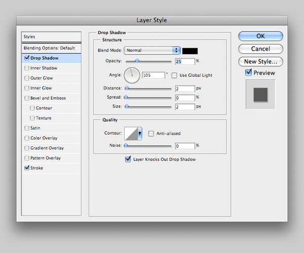
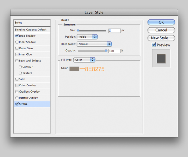
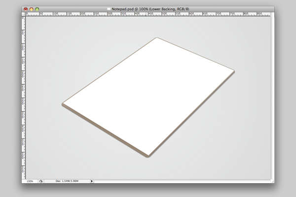 Now we’re going to duplicate our layer, and move it upwards by one pixel. We could do this by duplicating the layer then moving it, but a far quicker way is to press Alt + Up Arrow on your keyboard. You’ll notice the paper now appears slightly thicker. Before we continue and duplicate any more times, we’re going to select the duplicate layer, call it Darker and open it’s Layer FX panel. Apply the following settings.
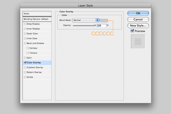
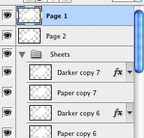 Now we’re ready. Make totally sure the Darker layer moved up when you duplicated it, then by holding Shift while clicking, select both layers. With both layers selected, press Alt + Up Arrow seven times. You should now have a more 3D stack of paper. The only change we need to make now is selecting only the top layer, duplicate it one more time. Select your new top layer, left click and choose Clear Layer Style. It’ll now appear white. You can now drag the top layer out of the Sheets folder and rename it Page 2, then make another duplicate above it called Page 1. These will be used to create the visible content.
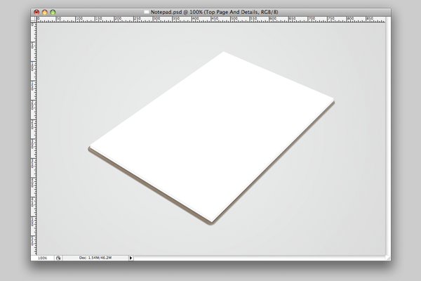
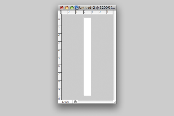 Press M on your keyboard to select the Marquee tool. We’re now going to select the bottom two pixels of our canvas, and then use the paint bucket tool to fill them with the color E5FFFA.
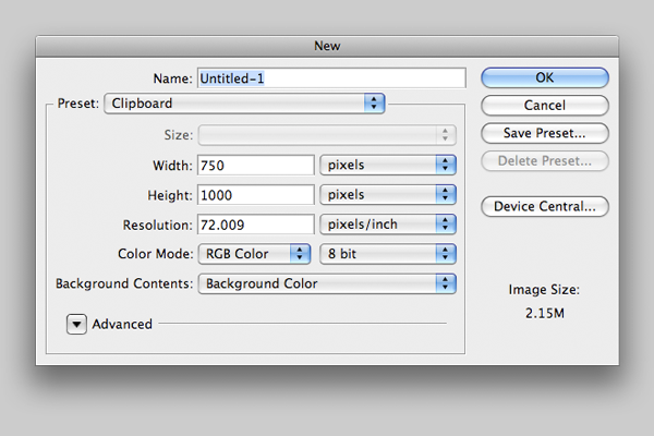
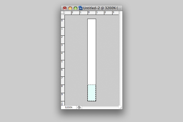 Now clearly we want this to repeat and make us a lined pattern. You could copy and paste, but the following method is far simpler. Press Cntrl + A, or Command + A for mac users, on your keyboard to select the whole document. Go to Edit > Define Pattern and then call it Lines before pressing OK. We’ve now saved our line as a pattern, so you can close the document you created it on. Now we need to make another new document, but this time the size should be seven hundred and fifty by one thousand pixels.
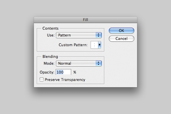
 With your new document open, go to Edit > Fill. Under contents, select to use a Pattern as your fill, and then click the box next to Custom Pattern. From the options, select the last one at the bottom, which should be the pattern we just created. Once done, click OK. If you’re unsure of anything, compare with the image below.
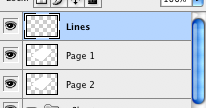 You should now have a document filled with blue, horizontal lines. Press Cntrl + A, or Command + A on a mac, to select all of them then Cntrl + C, or Command + C on a mac. Now go back to your Notepad document. We want to create a new layer just above Page One. Call the new layer Lines.
Now we need to place our blue lines over the paper, but in a way so that they’re aligned nicely with the paper. The way we’re going to do this is by using Photoshop’s Vanishing Point filter, which can be found under the Filter menu. Open it up, and you’ll see that your cursor is a little target shape. Using this, click just outside each corner of your piece of paper.
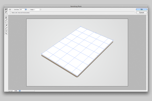 You can drag around the corners until you’re totally happy with the shape, or delete them and start again if you think you need to. Now, press Cntrl + V or Command + V on a mac to paste your lines. By dragging them towards one of the blue outlnes, you should be able to snap them to your grid. Press OK when you finish.
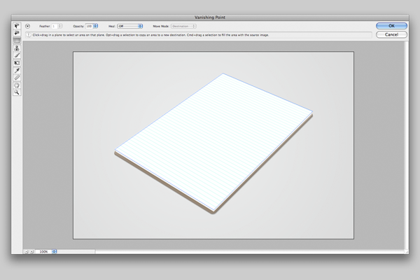 Now, you should have some nice blue lines on your paper! If they’re too big like mine, you can left click the Lines layer and select Clipping Mask to sort them. Grab the Polygonal Lasso tool by pressing L on the keyboard. If you get the standard lasso, click and hold it’s icon in the tools palette. Select the top line, and delete it so that it looks like a normal notepad page with space for a title. Also, we’ll set out lines to 25% opacity.
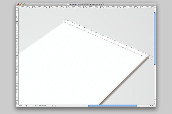 Adding text is simpler than the lines, beause of the size perspective doesn’t matter so much. First of all, grab the text tool by pressing T on your keyboard, and pick a handrwriting style font. Size is up to you, but I’d reccomend something pretty small. Text is more decoration than a proper part of the image, so it doesn’t matter. Once you’ve your chosen text, you’ll need to rotate it so that it matches the direction of the lines.
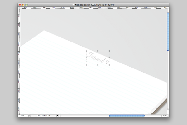 Repeat this a few times, until you have all the text you want on the page. It’s worth noting that if you’re adding text at the very top and the very bottom, slightly increasing the size might be necessary because of the perspective on the lines.
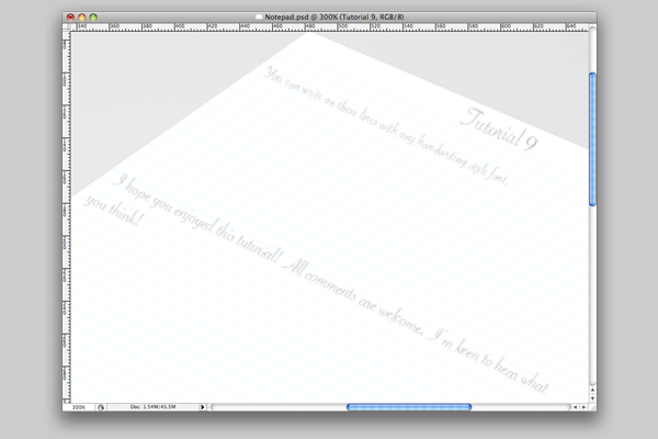 Perhaps we want to add a picture, though. If so, just rotating it won’t be enough. At this stage, you need to get your image ready by resizing it, and adding a border if you’d like to. You’ll also need to rotate it slightly unless you want it totally straight on the paper.
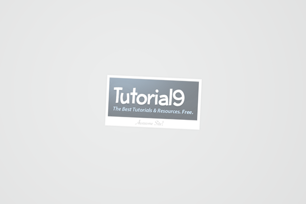
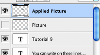 Once you’re happy, merge all your mayers into one, call it Picture, Cntrl + A or Command + A on mac to select all, then Cntrl + C or Command + C to copy. Hide the merged layer by checking the little eye icon next to the layer. Make a new one called Applied Picture, then re-enter the Vanishing Point filter. Luckily, Photoshop still has our vanishing point grid from last time, so we can just paste our picture in by pressing Cntrl + V or Command + V, and snap it to our grid where you want it. When you’re happy, press OK and then make the final size adjustments using the transform tool.
Depending on what image you used, it could be worth setting the opacity to 50%. This makes it look far more real when we come to put a cover over our notepad.
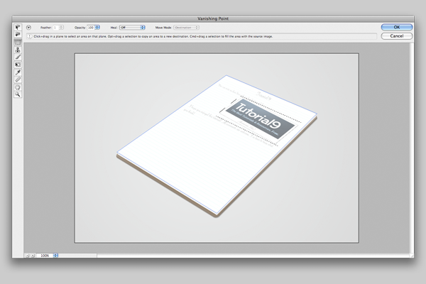 If you want to add some tape over the corner of your image, first create a new layer and call it Tape. Using the Polygonal Lasso tool, by pressing L on your keyboard, draw the shape of a piece of tape, fill it with black, and set the layer opacity to 5%. I did, and also added the Tutorial9 Cloud logo in the style of a drawing, using the same method as above. We’re going to move onto creating a cover now, but if you want to add an extra touch try adding a fold to the paper like I did.
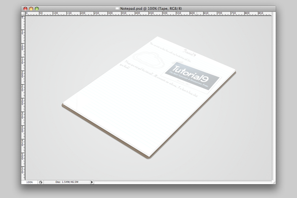
Okay. To create the cover we don’t need to create a new shape altogether, just copy our base layer. Find the layer we called Lower Base, duplicate it, drag it to the top of the layers palette then rename it Cover. Then, left click it and pick Clear Layer Style from the menu that appears. You also need to move it up around eight pixels, so that it looks like it’s on top of the paper.
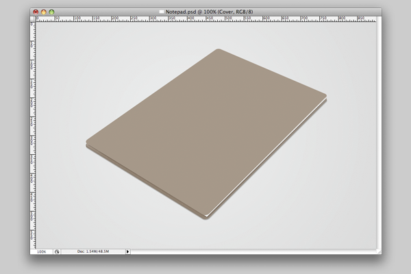
 Now, enter the Layer FX panel like we did before, and select Colour Overlay. Use CCCCCC as your colour, so that the cover appears a shade of light grey. Click OK. Now you need to create a new layer below the Cover layer, and then merge it with your cover. We’ve done because Colour Overlay hides some of the other Layer FX effects, and by merging it with a blank layer actually convert the layer to that grey colour, rather than it being like an overlay.
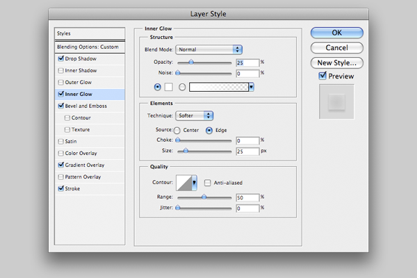
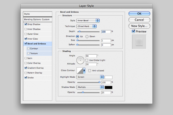
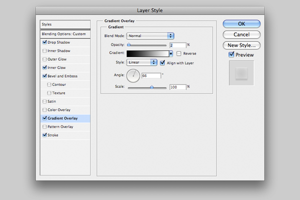
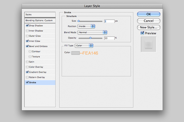
Set the Cover layer’s fill to 10% (fill is located under opacity) then apply the following Layer FX to it.
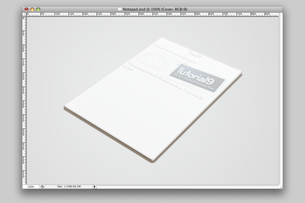
 And now with any luck, you’ll have something smiliar to this.
 We’ll add some gloss to it now. Create a new layer called Gloss, then press P on your keyboard to select the Pen Tool. Now draw some glossy shapes on this layer, and fill them with white using the Direct Selection tool like before.
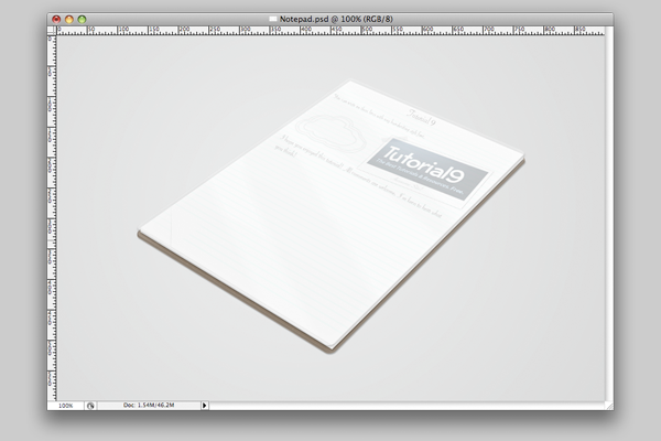
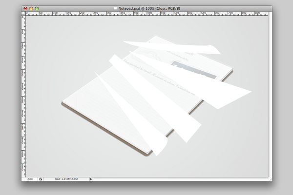 When you’re happy with your shapes, blur them by five pixels, set the opacity to 55%, then left click and set it as a clipping mask to the Cover layer. The effect isn’t very noticable now, but adds a nice look to the edges.
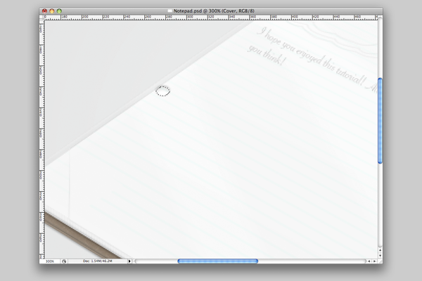 Once you have your selection in the right place, press Backspace on your keyboard. As you’ll see, the hole is pretty much done because of the layer FX we applied to it’s layer! Repeat this step about a third of the way from the top. The holes are pretty much fine as they are, but to add a bit more detail try adding an extra border to the holes like I have below.
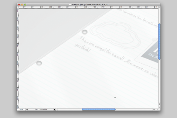 Finally, we need to create the rings. Create a new layer called Lower Ring. Press M to get your Elliptical Marquee tool back, and create a circular shape like mine below.
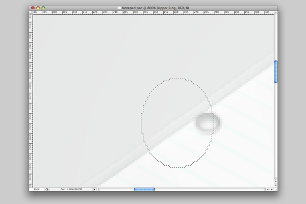 Now fill your selection with the colour CCCCCC.
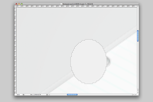 Before you get rid of your selection though, go to Select > Modify > Contract, and contract your selection by three pixels before pressing Backspace on your keyboard to clear it.
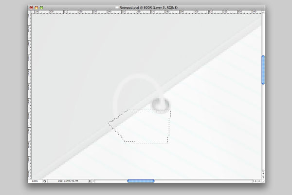
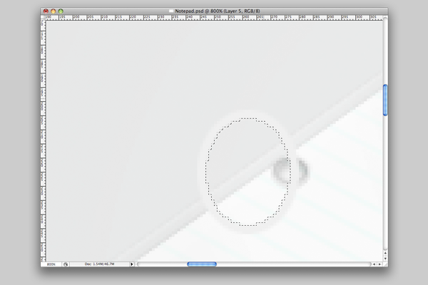 Finally, select the area hidden by the cover, by pressing L on your keyboard to get your Polygonal Lasso tool back, and clear it.
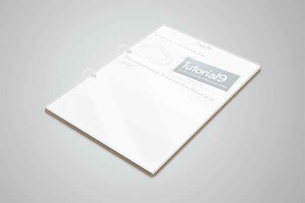
 Now just repeat this step for the ring at the top, and we’re finished! I hope you enjoyed creating this, and learned some Photoshop skills along the way. For my final image, I made the background a touch darker and added a reflection, both of those edits can be found in the PSD. Thanks for reading!
Step 1: Setting Up
Step 2: Drawing The Base
Step 3: Adding Layer FX
We’re now going to apply the following Layer FX to our layers. Double click on the blank space after the layer’s name, or press the FX button at the bottom of your layers palette. Apply the following styles to the Upper Base.Step 4: Texture
Make a new layer, Texure 2, then repeat the process of filling and adding noise to it. This time though, before we make it a clipping mask we’re going to go to Filter > Filter Gallery, and under Artistic select Dry Brush. Your settings should be as follows, Brush Size: 2, Brush Detail: 5, Texture: 1. If you’ve done that correctly, you’ll now have just a few rough looking patches of white, on a black background. Now set the blend mode to Screen and the opacity to 10%, and make the layer a clipping mask.
This is what your image should look like at the end of this stage. If it doesn’t, I’d suggest trying to adjust what you’ve done, as it really isn’t that complicated.
Step 5: Paper
Okay, let’s start. First off we need to draw the shape using the pen tool. Press P on your keyboard like we did last time, to launch the pen tool. Now we need to draw a square shape, ensuring that it has the same perspective as our base. As with the first path, if you’re struggling to get it right you can use mine.
Step 6: Adding Lines And Details
Okay, we’re finished with that document for a bit. Now, we want to create a pattern that looks likes lines on a page. Create a new document one pixel wide by four down. Zoom right in so we can work accurately.Now we need to place our blue lines over the paper, but in a way so that they’re aligned nicely with the paper. The way we’re going to do this is by using Photoshop’s Vanishing Point filter, which can be found under the Filter menu. Open it up, and you’ll see that your cursor is a little target shape. Using this, click just outside each corner of your piece of paper.
Depending on what image you used, it could be worth setting the opacity to 50%. This makes it look far more real when we come to put a cover over our notepad.
Step 7: The Cover
Just before we get going on this step, I’d advise you to take a few minutes to organize your layers into groups like we did before. We have quite a few layers now, and so things will begin to get pretty cluttered if you don’t.Okay. To create the cover we don’t need to create a new shape altogether, just copy our base layer. Find the layer we called Lower Base, duplicate it, drag it to the top of the layers palette then rename it Cover. Then, left click it and pick Clear Layer Style from the menu that appears. You also need to move it up around eight pixels, so that it looks like it’s on top of the paper.
Set the Cover layer’s fill to 10% (fill is located under opacity) then apply the following Layer FX to it.
 Previous Article
