Dynamic Black & White Scene with Geometric Elements
http://cs5tutorial.net/dynamic-black-white-scene-with-geometric-elements/
Click on the preview image to see the work in full scale.
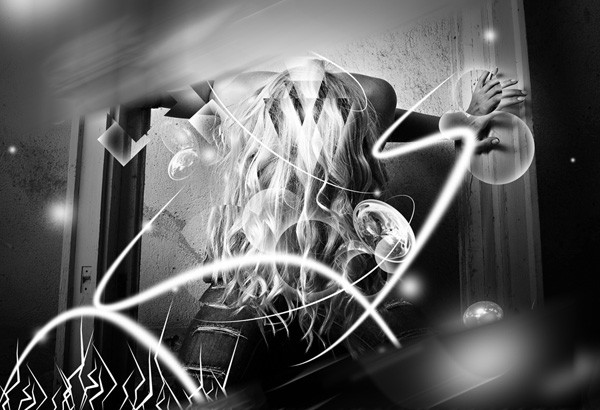
Tutorial Resources
- Stock image: Model stock – “Ready, steady…” by Victor Stoyanov (Stockvault.net)
- Stock image: Fractal 1- “My Fractal Stock 108.” by MyFractalStock (deviantART)
- Stock image: Fractal 2 – “Stock 12.My Fractal Stock” by MyFractalStock (deviantART)
Step 1: Processing the Subject Image
Download the Model stock and open it in Photoshop. Since we are going to do all of the manipulation over this same image, we do not need to create a new document.If you prefer using your own images instead of the stock image above, just convert it to black and white by desaturating it (Shift + Ctrl/Cmd + U). I encourage you to use another image so that you can come out with artwork that looks different; the techniques I will show you are flexible enough to be applied on other images.
For example, here are some other images from the same photographer (Victor Stoyanov) you can use:
- Stop! Let me out.
- Ready to start…
- Go!
- Motion…

Step 2: Displacement Effects
Start by unlocking the default Background layer (which should be the only layer so far) by holding down Alt/Option and double-clicking on the layer’s thumbnail in the Layers Panel; if successful, it should remove the padlock symbol and the layer’s name should change to Layer 0. Next, duplicate the layer by making sure it’s the active layer and then pressing Ctrl/Cmd + J.Take the Pen Tool (P), set its option to draw in Paths mode in the Options Bar, and draw a triangle-shaped path on the center of the image. We are going to create a prism that will be the starting point of the composition.
Convert the path into a selection by right-clicking inside it (on the canvas) and then choosing Make Selection from the menu that appears. Copy (Ctrl/Cmd + C) and paste (Ctrl/Cmd + V) the selection, which will create a new layer with the triangle shape. We are going to save this new layer for later.
Do not deselect your triangle selection yet!
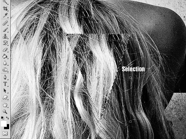
Create a new layer (Shift + Ctrl/Cmd + N). Switch to the Brush Tool (B) and select a soft, round brush about 200px wide set to 70% Opacity, with white as your Foreground color.
On the new layer, brush over the triangle selection to create a semitransparent white triangle — this is one of the shapes that we will be using to create the prism effect.
Do not deselect your triangle selection yet (we need it yet again)!
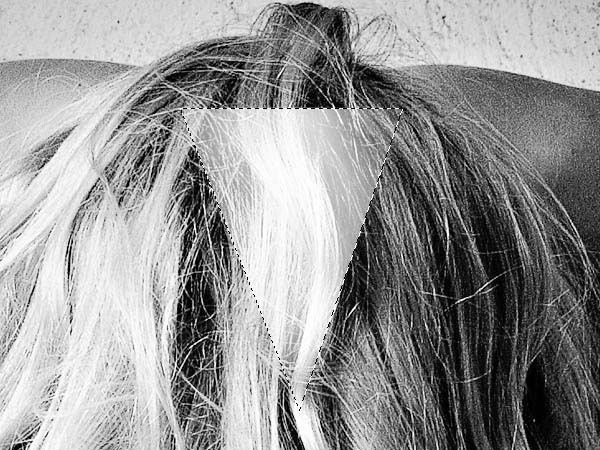
For now, toggle off the visibility of the layer with the semitransparent white triangle. Then create a new layer. This time, invert the selection (Select > Inverse, shortcut: Shift + Ctrl/Cmd + I) and use the Brush Tool with the same settings as above to brush inside the triangle and paint outside its edges.
You can toggle back on the visibility of the second layer we made.
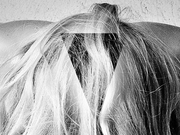
Now duplicate the 3 layers we just made by selecting them in the Layers Panel and then pressing Ctrl/Cmd + J. It wouldn’t be a bad idea to place the 3 layers in a layer group (Ctrl/Cmd + G) so that if you make a lot of triangles, our Layers Panel will remain manageable.
Arrange the duplicates and use Free Transform (Ctrl/Cmd + T) to create different forms and shapes. Experiment with the position and the opacity of the layers to get different results. Try to change layer blending modes to see what happens.
Here is what I got after duplicating each layer a couple of times and changing their positions:

Step 3: Circular Displacement Geometric Elements
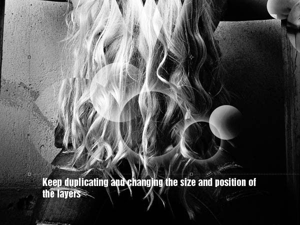
Grab the Elliptical Marquee Tool (M) to make a selection, holding Shift to make a perfect circle. Make selections of different sizes and copy the shapes into new layers, slightly moving them to get the displacement effect, similar to the previous step.Just like with the triangles, use the Brush Tool (B) to paint inside the selections or invert them and brush outside the edges to get a more diverse variety of shapes.
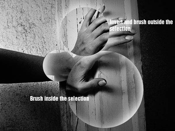
Keep making more selections and duplicating the light circles around the composition.
Step 4: Square Geometric Shapes
Now choose the Rectangular Marquee Tool and make a selection, holding the Shift key to make perfect squares. Right-click inside the selection, choose Transform Selection from the menu that appears, then rotate the square selection to something like this (a diamond shape):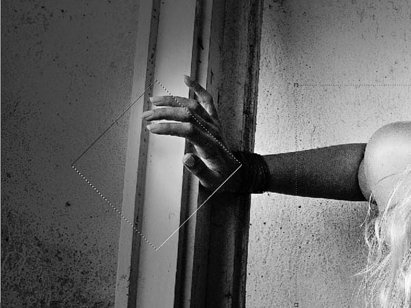
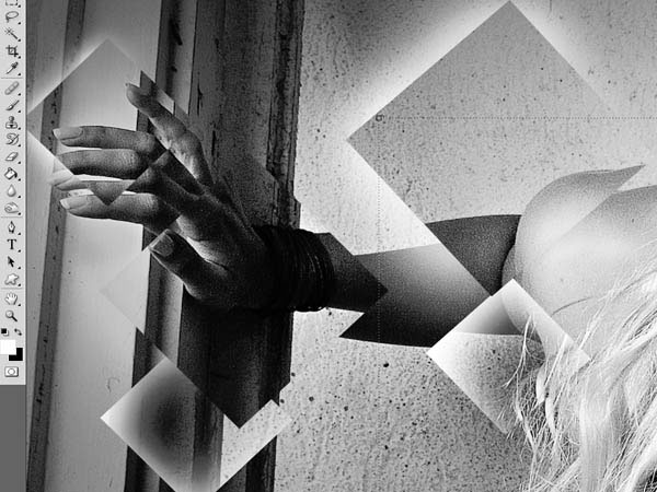
Now repeat the process discussed in Step 3 and make different selections and square shapes around the subject’s hands. Remember to keep changing the size and position of the effects so that your composition will look more intricate and polished.
Try and experiment with different shapes while doing this technique; you can also use diamond shapes or stars (which can be drawn using the Custom Shape Tool), for example, to get more complex and interesting results.
Step 5: Adding Details Using Fractals
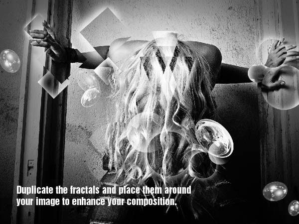
To enhance details on the shapes, we will use some fractal stock images. Go ahead and download both of these fractal stocks: Fractal 1 and Fractal 2. Once downloaded, open them in Photoshop, and place them into your document. Desaturate them (Image > Adjustments > Desaturate) and increase their brightness using Brightness/Contrast image adjustment (Image > Adjustments > Brightness/Contrast).Transform them using Perspective Transform (Edit > Transform > Perspective). Also, duplicate the fractals several times and move the duplicates around in various places of your composition.
Step 6: Creating Light Beams
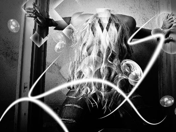
Our scene, as it stands, can have a bit more dynamism. So now, we will add light beams to support the high-impact, high-motion elements of the piece. What’s more is that these light beams will add a fascinating contrast to the simple black and white colors we have.To start, create a new layer on top of all the other layers. Choose the Brush Tool (B) and select a soft, round brush that’s about 65px wide with 100% opacity. With the options set, switch to the Pen Tool (P) — we weren’t really going to use the Brush Tool, it was just an easier way to set the Pen Tool’s stroke (which we will utilize very shortly).
Draw some curvy paths along the body of the subject. Once you’re happy with the path, right-click on it in the canvas, then choose Stroke Path from the menu that appears; this should open the Stroke Path dialog window. In the dropdown menu of the Stroke Path dialog window, make sure that Brush is selected. Also, check the Simulate Pressure option.
Using the Stroke Path command will stroke the path we drew, making it look like light beams/light streaks.
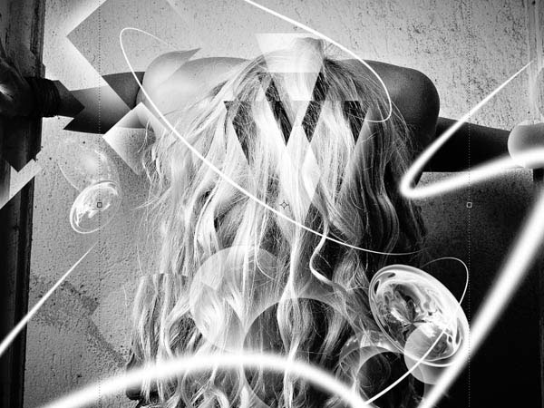
Create another layer and switch back to the Brush Tool (B); again, we are just using the Brush Tool to set up the stroke for our Pen Tool. This time, select a hard, round brush that’s about 10px wide with 100% opacity. Switch back to the Pen Tool (P) once again and draw some more round paths wrapping around the body of the subject. Then just stroke the path again using the method we discussed previously. Remember not to overdo these lines to keep a nice flow on your composition and so it doesn’t take away from the other components of our scene.
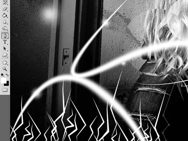
To create even more details and variety on the light beams, we are also going to create bolt-shaped lines. Switch to the Brush Tool (B), choose a hard round brush that’s about 7px wide, and then go back to the Pen Tool (P). This time, instead of drawing curvy paths, draw some zigzag lines with different sizes. Once you’re happy with the paths, stroke them again using the same method as above. After making a couple of these zigzag lines, you can duplicate them, move the duplicates around, and then merge them into a single layer (Ctrl/Cmd + E) when you are happy with the positions:
Step 7: Creating Light Orbs
We will create another type of design element: light orbs. The purpose is the same, to support the dynamism we want this scene to have.Start by creating a new layer at the top of the Layers Panel. Pick a soft, round brush, lower its Opacity to 80%, and, on the new layer, paint some light orbs around the scene. Try changing the opacity and size of the orbs for heterogeneity.
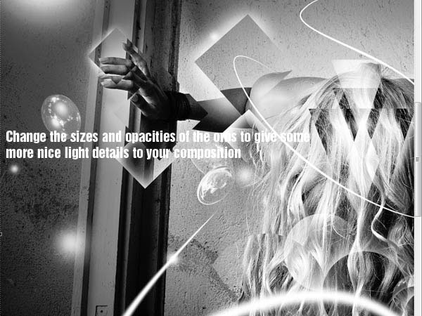
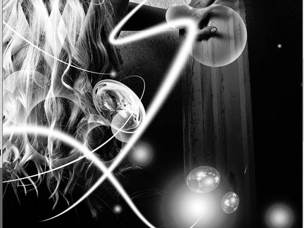
Step 8: Adding Motion Blurs
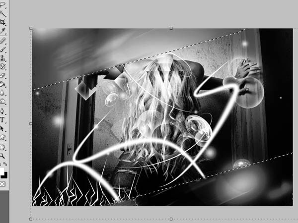
For a dynamic finish, we are going to add a very strong, very bold motion blur that will frame our image. It goes without saying that this motion blur’s purpose is to add more dynamism to the composition.First select all your layers and duplicate them (Ctrl/Cmd + J). Then, with the duplicate layers all selected in the Layers Panel, merge them into one (Ctrl/Cmd + E). Go to Filter > Blur > Motion Blur and use the settings shown below:

Add a layer mask to the blurred layer, then choose the Pen Tool (P). Draw a path in the shape of a rectangle that goes diagonally across the canvas, right-click inside the shape, choose Make Selection from the menu that appears, and fill the selected area with black (Shift + F5) to erase the selection (remember that on layer masks, black removes).

 Previous Article
