Build a Slick Rich User Interface in Photoshop
http://cs5tutorial.net/build-a-slick-rich-user-interface-in-photoshop/
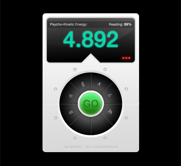


Final image preview

Step 1
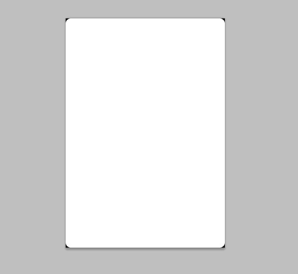
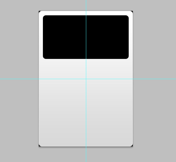
Open up Photoshop and create a new document with a black background. Set the dimensions to 320x460px. Grab the Rounded Rectangle shape tool and set the corner radius to 10px. Draw a white box filling the canvas.
Step 2
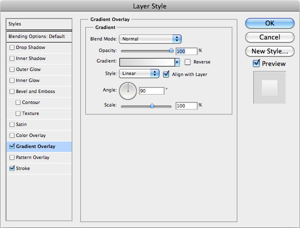
Add some depth and detail to the rectangle by adding a Layer Style. First, add a Gradient Overlay ranging from #d8d8d8 to #ffffff.
Step 3
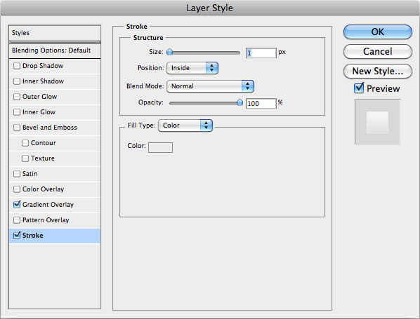
Next, add a 1px Stroke aligned to the inside of the rectangle with the colour swatch #ebebeb.
Step 4
Back with the Rounded Rectangle tool, draw a black shape to represent the LED screen. Drag guides onto the canvas and align the screen centrally.
Step 5
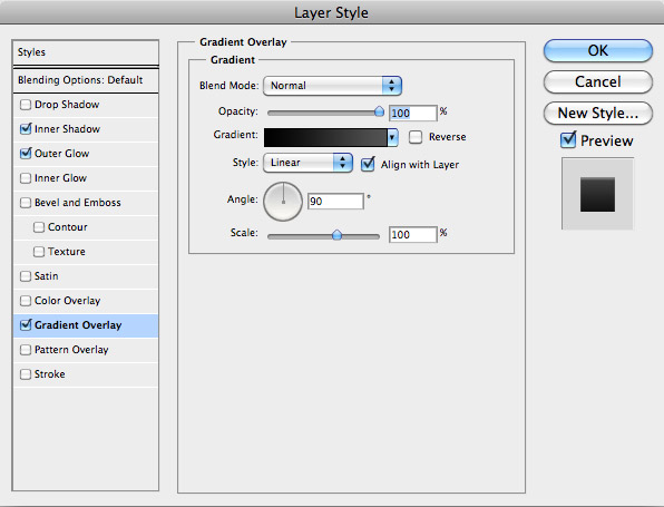
Add some Layer Styles to the screen, starting with a Gradient Overlay spanning vertically from #000000 to #535353.
Step 6
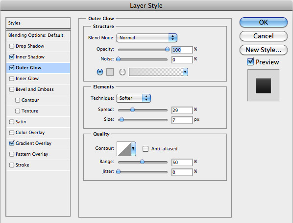
Next, add an Outer Glow using the colour swatch of #d8d8d8. Adjust the spread and size to create the impression of a bevelled edge around the screen to give the sense of depth.
Step 7
Finally, add a tiny Inner Shadow using a light grey colour (#848484). Adjust the settings so that the shadow is just 1px in size to leave a thin highlight scross the top rim of the screen.
Step 8
Draw a triangle using the Polygonal Lasso Tool and align it with the center of the canvas. Add a layer mask to the screen layer to knock out this triangular shape from the screen area.
Step 9
Use the Type Tool to mock up some stats and figures. Use a range of type sizes and weight to provide focus to the important elements.
Step 10
Double click the layer of the large number to add some Layer Style options. Start by adding a Color Overlay of a bright green (#00ffcc).
Step 11
Next, add an Outer Glow using the same fill colour. Adjust the size of the glow to give an illuminated appearance.
Step 12
Open up a new document at 4px by 4px. Zoom right into the document and use the Pencil tool to draw two horizontal lines across the canvas. Go to Edit > Define Pattern and give it a name of LED lines.
Step 13
Press CMD (or CTRL) key while clicking the screen layer’s thumnail in the layer palette to load the selection. Create a new layer then fill the area using the Paint Bucket Tool. Remember to select Pattern from the options dropdown, then select the LED lines pattern we’ve just created.
Step 14
Change the Blending Mode of the LED lines layer to Multiply to render the white areas transparent, then drop the Opacity right down to around 30% to tone down the effect.
Step 15
Draw an Elliptical Marquee across the screen area, then trim it down to size by clicking the screen layer’s thumbnail while holding the SHIFT, ALT and CMD keys. Drag a white gradient across the mask to create a highlight, then drop the opacity to around 7%.
Step 16
Draw a large circle in the main body of the interface and fill with a linear gradient of #ffffff to #d8d8d8. Align the circle centrally according to the guides.
Step 17
Duplicate the circle and scale it down while holding the ALT key. Fill this circle with a #b1b1b1 to #000000 radial gradient.
Step 18
Now let’s create another repeating pattern swatch. This time create a new document of 10px by 10px and draw some marks with the pencil tool to replicate the following image. Define this image as a pattern.
Step 19
Load the selection of the inner cirle layer. Then create a fresh layer and fill with the newest pattern swatch.
Step 20
Change the blending mode to Multiply, then drop the opacity to 30% to tone down the effect.
Step 21
Create another circle using the grey to white gradient and scale into position to sit centrally. Add a soft Drop Shadow and a fine white stroke to add little touches of depth.
Step 22
Duplicate the circle and scale it down slightly. Edit the Layer Styles to include a vibrant green Gradient Overlay (#186f00 to #4df871).
Step 23
Next add a fine stroke using a darker green tone of #8ebc8b. Set this to 2px in size and aligned to the outside to give a subtle bevelled edge appearance.
Step 24
Finish off the button with a soft Inner Glow. Use the oftens of a white glow set to Screen, with large 13px size and opacity toned back to around 27%.
Step 25
Add a little command to the button, such as the word ‘GO’. Scale and position the word centrally on the button.
Step 26
Head into the Layer Style options and add a green Gradient Overlay ranging from #208512 to #228b17.
Step 27
Next add an Inner Shadow using the default black swatch, but drop the opacity right down to around 4% and adjust the sizing and distance right back to 5px.
Step 28
Add a tiny highlight to the bottom of the button text using a Drop Shadow, but go in and edit the settings to use a white colour set to Normal. Also adjust the distance to 0, size to 1px and drop the opacity to around 50%.
Step 29
Create a new layer below the central button, then use the marquee tool to draw a 2px selection. Fill the selection with black, then nudge it 2px to the right and fill with grey.
Step 30
Duplicate the layer, then press CMD+T to transform the shape. Use the rotate option while holding Shift to create multiple instances of the lines facing in various directions. Drop the opacity to 28% to give the impression of a collection of individual buttons in the central control area.
Step 31
Use the Type tool once more to position a range of symbols onto the buttons. Don’t forget to rotate each one to face in the correct direction depending on the orientation of each button.
Step 32
On a new layer, use the Single Row Marquee tool to draw a 1px line across the document. Fill this with white, then nudge the selection 1px and fill with grey. This simple trick gives the impression of a chiselled joint line.
Step 33
Draw a small circle using the Elliptical Marquee tool, then right click and select Stroke. Enter 2px in the options to create a mini donut shape.
Step 34
Head into the Layer Style options and add a grey Gradient Overlay. Select swatches of #d6d6d6 to #dedede.
Step 35
Next, add an Inner Shadow. Use settings of 5px and adjust the opacity right down to 25% to tone down the effect.
Step 36
Create the bottom highlight effect using the Drop Shadow. Remember to change the colour to white and select the Normal blending mode.
Step 37
Duplicate the tiny circular shapes and position them around the control dial.
 Previous Article
