Designing a Christmas-Themed Web Layout
In this tutorial I will be teaching you how to create this complete, festive Christmas-themed web layout! Note: This tutorial may be more well-suited for intermediate Photoshop users, as it does require quite a bit of Photoshop knowledge and work! Please feel free to try it though, if you’re unable to get it right, just try it over again a few times.

(click for larger preview)
1. New Document
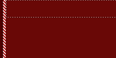
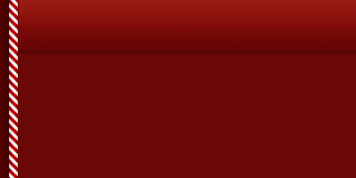
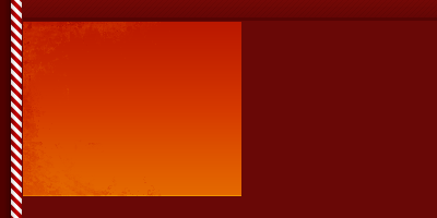
First of all, let’s start by creating a new document for the template we’re designing. I’ll be using a rather small document size of 780 x 880 pixels for this tutorial. So, now you’ve created the new document, fill the background with a nice color. I used a dark-reddish color, #4f0100.2. Designing the Sidebars
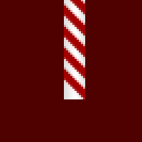
Now we’ll create the candy-themed sidebar thingiesFirst, start by making a selection with the Rectangular Marquee Tool, about 10 x 80 pixels. Be sure you’re on a new layer then fill the selection with white.


Next, after you’ve created your base bar, create another layer then get out the Polygonal Lasso Tool.
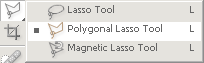
Holding shift, click around and make a diagonal selection like the one shown below:
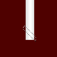
Now, be sure you’re on a new layer, fill your newly-made selection with a bright-red color. Now delete the edges so that your newly-made shape is constrained to your base bar.
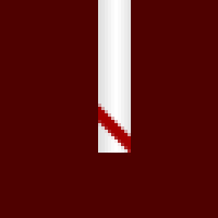
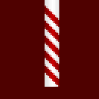
Duplicate your new line layer and move it up about 10 pixels (shift+up arrow key)
Duplicate again and move it up 10 pixels again. Repeat this 2-3 times.
Merge your all of your ‘candy stripe’ layers together and apply this Gradient Overlay, you should now have a result pretty much like this one shown:
Next, apply this Gradient Overlay to the main white rectangle layer, it just gives it a little bit of detail:

Now we need to cut our bar up and make it into a pattern that tiles seamlessly. Make a selection the whole width of your bar, but only of about as much as mine in height:
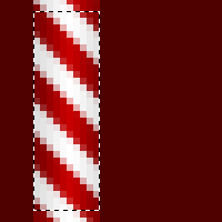
Do you see how mine words? I’ve left two pixels of the top line off, and got 2 pixels of the top of the bottom line in my selection. You could also do it whatever way you want really, but just make sure it tiles! Cut this selection out, duplicate it, move it downwards, merge, repeat. You should now have a sidebar similar to mine:

Duplicate your sidebar, flip it horizontally (Edit > Transform > Flip Horizontal), then move it to the right side of the template. I also applied an Outer Glow to both of my sidebar layers.

3. Designing Your Header Bar
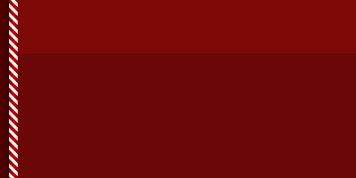
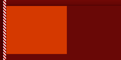
Moving along, start by creating another new layer, then make a rectangular selection completely in-between both the sidebars, fill it with a slightly lighter-red color than what you used in the background. (#690806)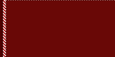
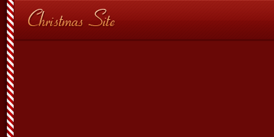
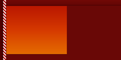
Now, to make the header bar. Create a new layer then make a selection approximately 738 x 60 pixels in the middle of the document at the top. (note: you might want to keep your layers in layer sets/groups so you can keep things in order)
Fill the selection with a yet lighter-red. (#7e0a07)
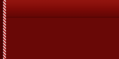
Next, apply the following layer styles and settings to your header bar:
- Inner Shadow
- Gradient Overlay
- Pattern Overlay (download .pat file)
Create another new layer then a selection half the height of the header bar, fill this selection with a white to transparent gradient, this is for a nice shiny highlight.
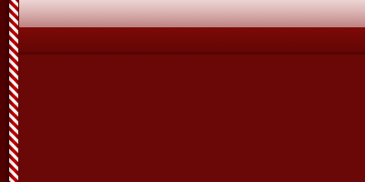
Change the layer mode for this gradient layer to Soft Light and lower the opacity to around 15-30%, it really depends on how it looks and how you want it to look.
Again, create a new layer, then make a 1px white line across the top of the header bar, this is really optional though, I don’t think anyone’s going to notice it!

Change the layer mode for this layer to Soft Light and lower the opacity to about 30-50%.

Lastly for the header bar, we need to add in some text. Get out the Horizontal Type Tool (regular text tool) and write out something like “Christmas Site” with a cursive/script-style font (in this example I’ve used a font called Cornet, but it’s a commercial font, not a free one, sorry.)
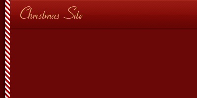
In the above image I’ve used #edb27a for my font color, and if you don’t have any decent script/calligraphy fonts, you can of course download some from DaFont: DaFont Calligraphy Section.
Right-click your text layer, go into the Blending Options, and apply the following layer styles/settings:
- Drop Shadow
- Gradient Overlay
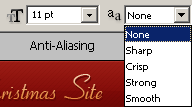
Looking pretty nice so far, but now we need to add some navigation buttons/links. Get out the Text Tool again and write them out, using a small-sized, web-based font. Remember to set the Anti-Aliasing to None when making regular text/links.
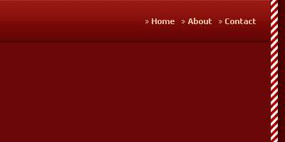
In the above image I’ve used: Tahoma, 11pt, Bold, #ebbe97, and Anti-Aliasing set to None.
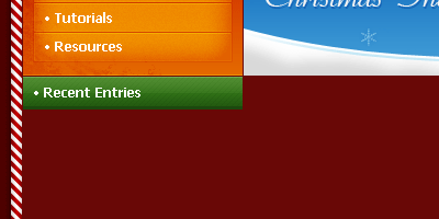
4. Navigation Area
Let’s make the navigation box/buttons. Firstly, start by creating a new layer, then make a large, rectangular selection underneath the header bar (with only about 1 pixel between them).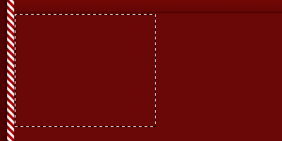
Now, fill this selection with a relatively bright-orange color, I’ve used #d53900 here. You can in fact fill the selection with any color you want, but for this tutorial you can use what I used!
After filling your selection, apply the following layer styles to your navigation box layer:
- Inner Shadow
- Gradient Overlay
Looking good! Now I’ve added in a little bit of grunge brushing on the left side of the box, for the sake of nice little details. For some nice grunge brushes you can go to PhotoshopBrushes.com and download some of their free brushes (they have paid ones aswell, just don’t get sucked in!)
A few other good brush resources are:
- Brusheezy
- Misprinted Type
- DeviantART
So, after you’ve done a little bit of black and white grunge brushing inside of your navigation box, change the layer modes to either Overlay or Soft Light and lower the opacity to around 40-60%, this will make your brushing blend in a little bit nicer.
Can you see it? Well, I can at least.
Next thing to do is add in the actual buttons. So, all on the same layer, make some button-sized rectangles 1px apart, just like mine shown here:
My selections were 180 x 26 pixels in size. Again, go into the Blending Options for your buttons layer and use the following settings:
- Blending Options: Main
- Inner Glow
- Bevel and Emboss
- Gradient Overlay
- Stroke
Very nice so far. Lastly for these buttons you need to add in the navigation text.
In the above preview I”ve used Tahoma, 12pt, Bold, #ffffff. Not bad so far, huh?
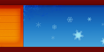
5. Designing the Header Graphic
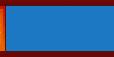
So let’s make that header graphic for the template now. Firstly, create a new layer then make a selection the same height as the navigation box, and all of the width left in the template (other than 1px at each edge, that is).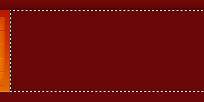
Fill this selection with a nice sea-blue color (I’ve used #1d78c4).
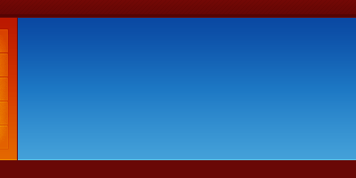
More layer styles. Apply the following layer styles and settings:
- Inner Shadow
- Gradient Overlay
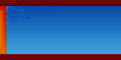
Again with the grunge, I added a little bit in the top left corner of the banner graphic. I then changed the layer mode to Overlay and left the opacity intact.
Now I’ve added in some snowflake shapes for a nice detail. For these, get the Custom Shape Tool out and use the snowflake shapes on a new layer.
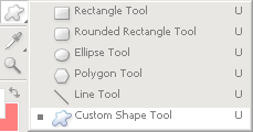
And here are the shapes:

If the shapes aren’t there for you, click the little arrow on the right of the box and select All, or Nature, then you should have the snowflakes shapes.
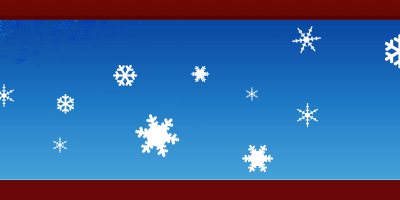
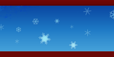
The snowflakes look quite cool just like that, but I went ahead and applied these layer styles anyway:
- Blending Options: Main
- Inner Shadow
- Outer Glow
- Inner Glow
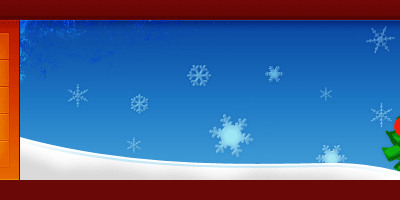
Next thing I did for the header was add in some trees. Please note that I did not make these, they’re some clipart I found on the internet somewhere. You can download them from here though: Carton Christmas Trees Clipart.
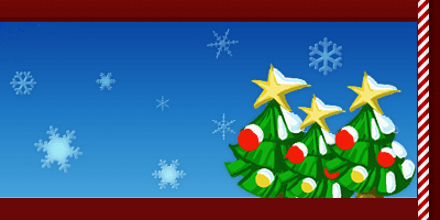
For the sake of tiny details, I then added a dark gradient 1px from the top of the banner and navigation box.
Now I’m going to add in a little bit of snow to the bottom of the banner. To do this, you’ll first need to create a smooth, hill-like path with the Pen Tool, make your path into a selection then fill with white (finish off by deleting excess white).
Finish this off by doing a little bit of brushing inside of the snow layer.
Lastly for the header, you need to add in some text, preferably your website name or some descriptive text. I’ve used the same font as before, so I recommend you do aswell.
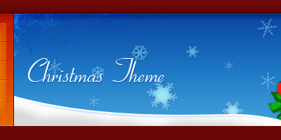
To this text layer I applied a Drop Shadow and a Gradient Overlay.
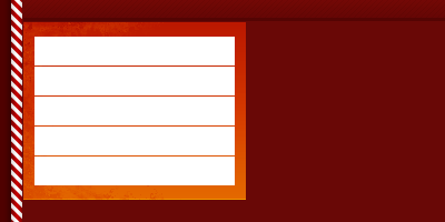
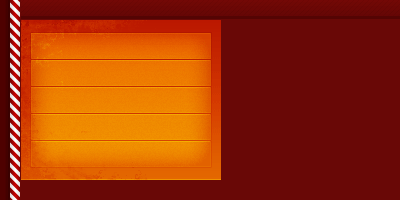
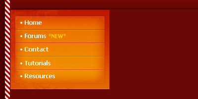
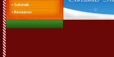
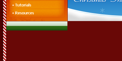
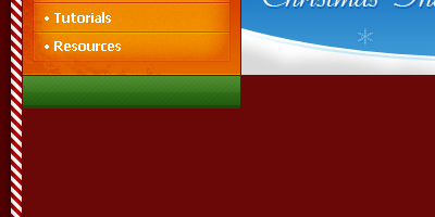
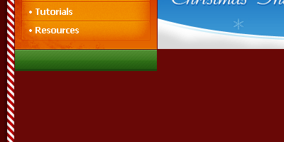
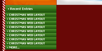
6. Recent Entries Sidebar Box
Now we’re going to create a recent entries (posts, articles, etc.) side box for the template. First, start by creating a new layer, then make a selection of about 200 x 30 pixels (same width as the navigation box).
Fill your selection with a nice, moderate-green (#307017). And now apply the following layer styles to this layer:
- Inner Shadow
- Gradient Overlay
- Pattern Overlay (download .pat file)
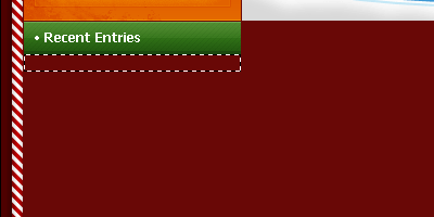
Looking good so far. Create a new layer then make a selection half the size of the main bar at the top. Fill this selection with a White to Transparent gradient.
Change the layer mode for this layer to Soft Light then lower the opacity to around 15-30%.
And then a 1px line at the top of the bar. For this layer change the layer mode to Soft Light and lower the opacity to about 50%.
I then added in text, similar to what I’ve used on the rest of the template.
Create another new layer, now make a selection a bit smaller than the first selection underneath it (my selection was 200 x 60 pixels)
Fill the selection with the same color as you used for the original, larger bar. Apply the following layer styles:
- Bevel and Emboss
- Gradient Overlay
- Pattern Overlay (Download .pat file)
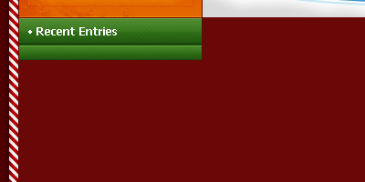
Duplicate this layer and move it down 16 pixels (if that’s how tall your rectangle is).
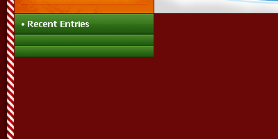
Repeat this until you have about 8-10 bars. Now add in your text.
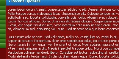
7. Designing the Content Area (Recent Updates)
Basically you just have to do the same as with the last bar. You could even duplicate the first bar and move it along, stretch it then change the color, that’s what I did, and it was easy!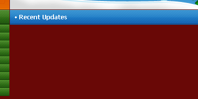
The color I used for the recent updates bar was #1f7bc5. Next thing create a large selection all of the width of the updates bar, not completely to the bottom though:
If you’re on a new layer, fill this selection with white then apply the following layer styles:
- Blending Options: Main
- Bevel and Emboss
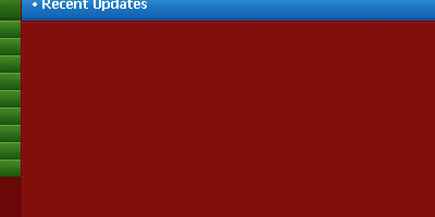
Add in some dummy text from Lipsum.com:
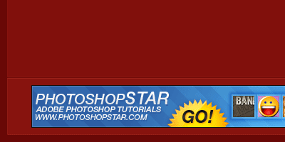
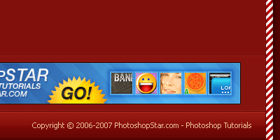
Lastly for this section, I added a smaller version of the content box at the bottom underneath the first one with a higher opacity, I made it 80px in height so it would fit an ad banner in it nicely.
8. Sidebar & Footer
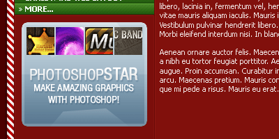
Remember the last step where you added in those low opacity boxes? Duplicate the main box, move it over to the left under the recent entries then crop it so it fits properly.
I then added in a nice little ad banner to fill it up nicely.
Ok, lastly we’re going to add in the footer. First make a selection at the bottom of your template where you want the footer to be. My selection was 738 x 40 pixels.
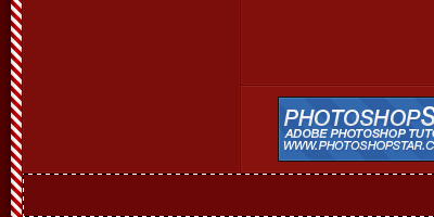
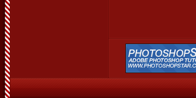
Fill this selection with a red color, I used #7e0a07. Next thing to do is apply the following layer styles:
- Inner Shadow
- Gradient Overlay
- Pattern Overlay (Download .pat file)

Now you can add in the shiny highlight like with the header bar. To remind you of that:
- Make a selection half the size of the footer bar.
- Fill the selection with a white to transparent gradient.
- Change the layer mode to Soft Light and lower the opacity to 15-30%.
- Make a 1px line at the top of the footer bar, change layer mode to Soft Light then lower the opacity to 40-70%.
Now lastly for the footer bar we’ll add in the text. On the left I wrote in the word “Copyright” in the same style as the text in the header bar. Then on the right I added in the actual copyright notice.
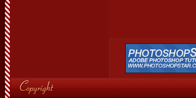
For the smaller text I used Tahoma, 11pt, #ebbe97.
And that’s pretty much it for this tutorial! I hope you enjoyed the tutorial, and I hope you were able to follow it through to the end easily.
 Previous Article


